Under a Lens: Stained Glass
Duration • 10 weeks
Software • Figma, Adobe After Effects, Procreate
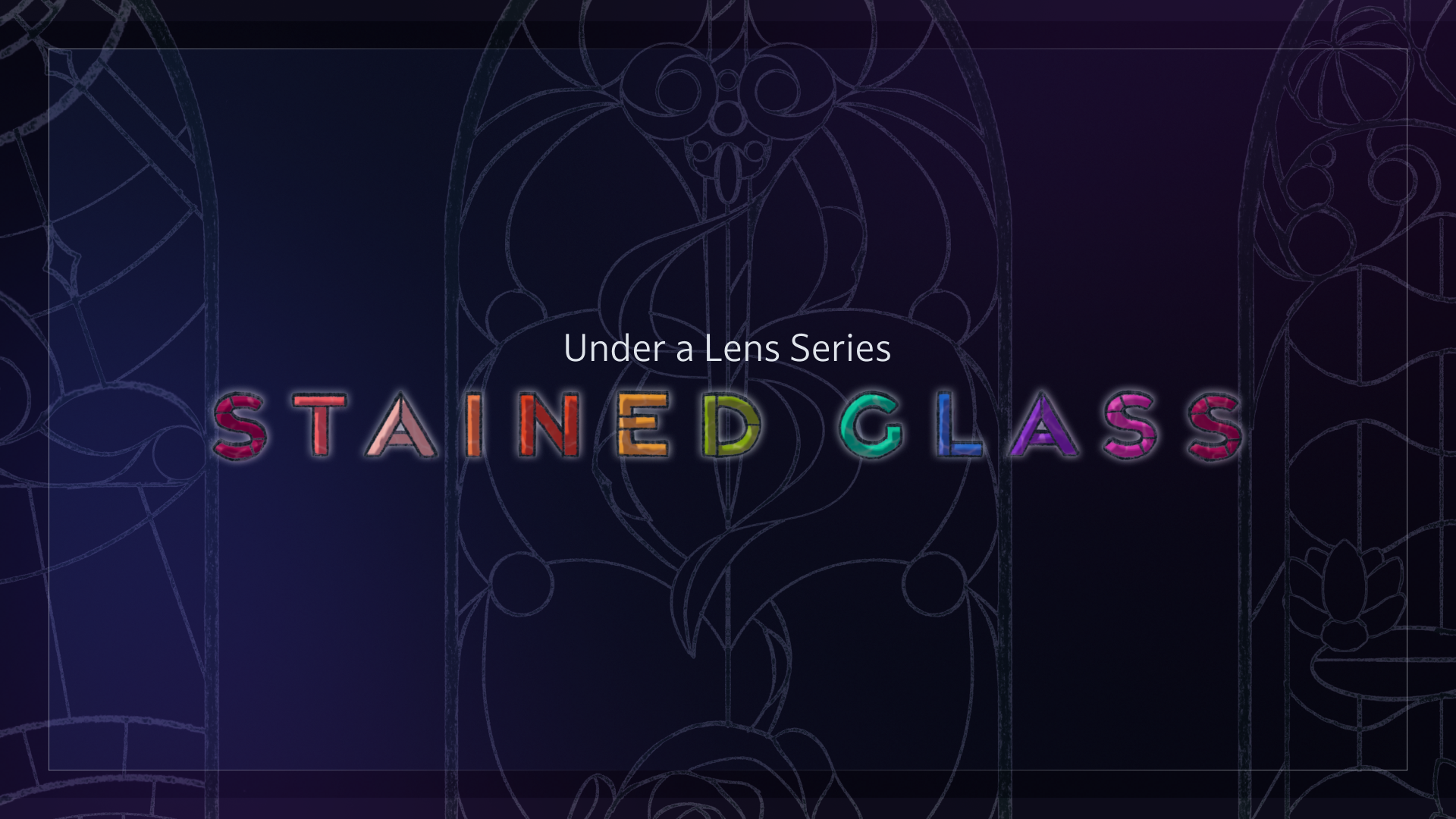
Let's make stained glass accessible.
Learning to create real stained glass windows is expensive and time-consuming. I aimed to create an digital interactive experience that is both beautiful and and allows visitors to experience creating without having to tackle the learning curve.
Design Process Overview

Sketching
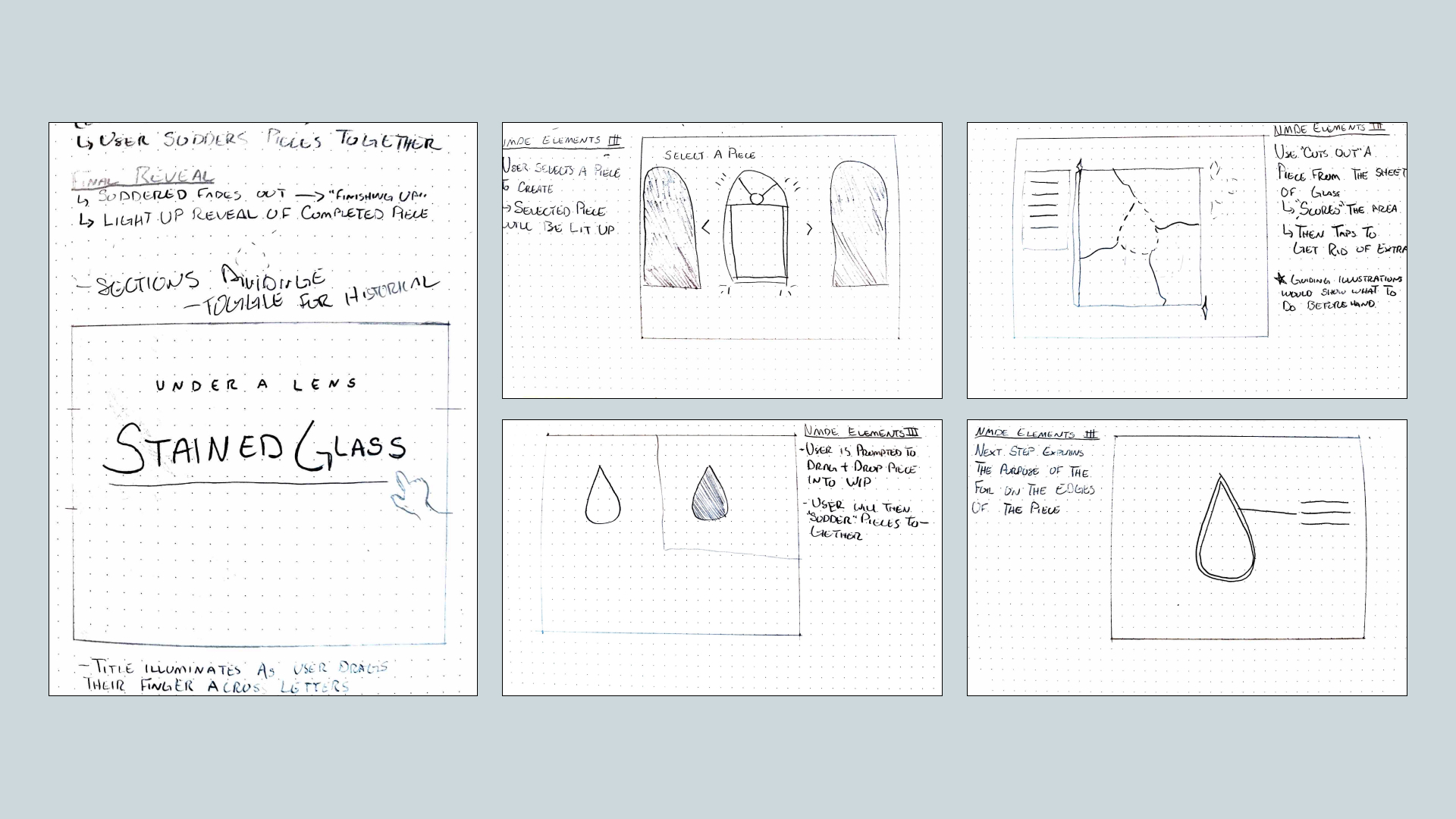
At the same time as conducting research, sketching general ideas for interactions and content helps me pin down the flow I want to create, as well as the layout.
Wireframes
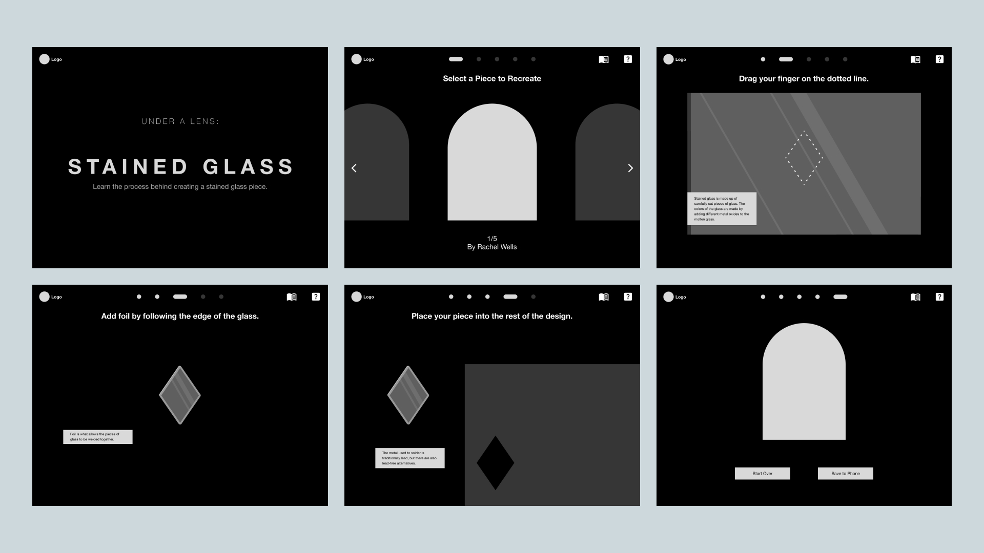
Exploring a general layout and starting to imagine what my illustrated assets may look like in the viewport, as well as testing navigation location and style to help the user understand where they are.
Inspiration Boards
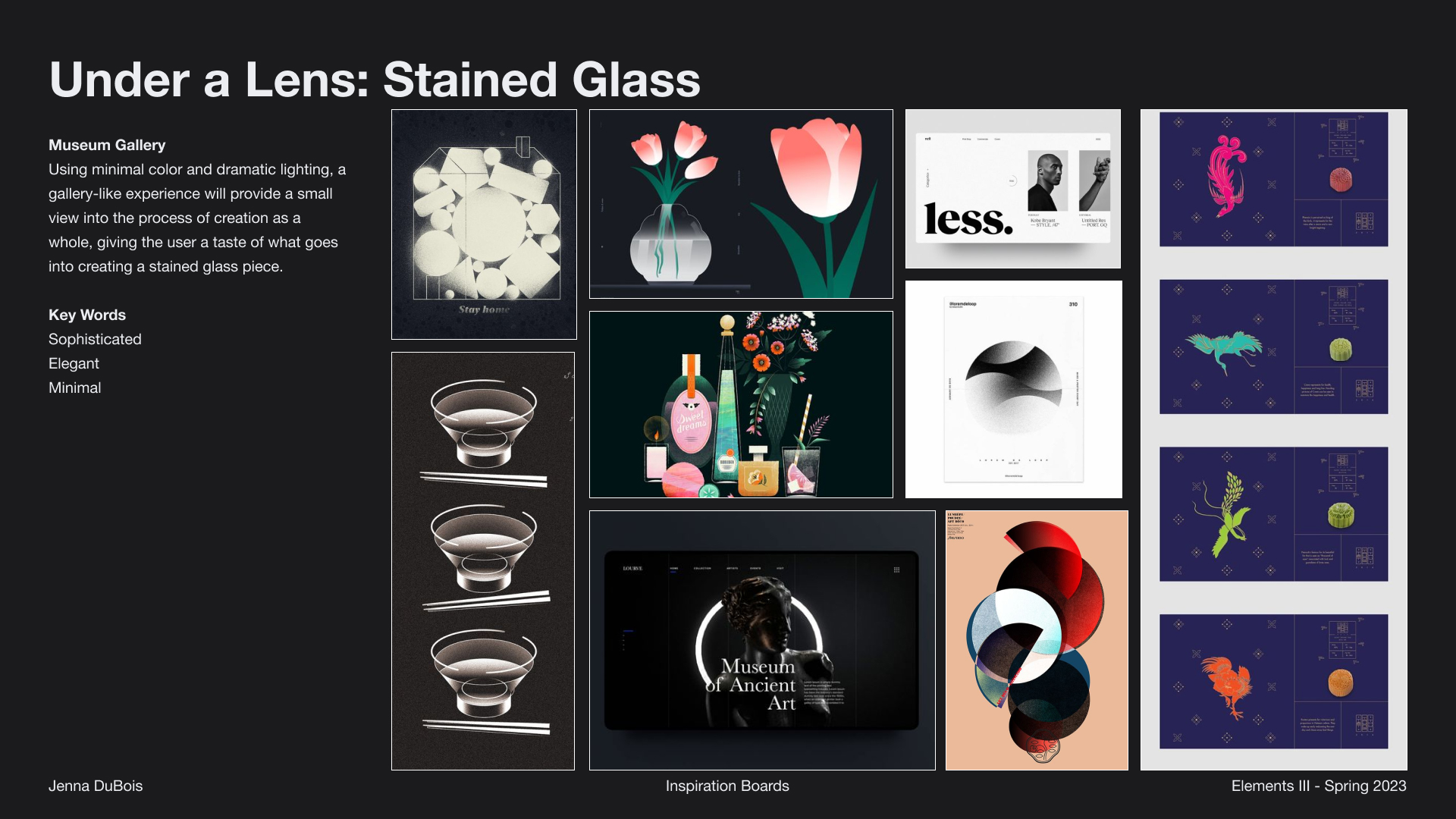
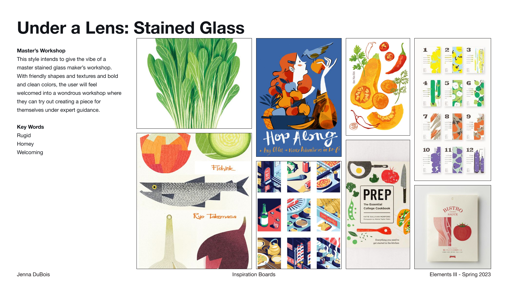
There were two main directions I was interested in exploring. One being more sophisticated, something you may see in an art museum with a focused exhibit in a dark room, and the other being more casual, having more of a craftsman's workshop feel.
Iterations
Through iterations, I figured out structure and navigation that strikes a balance between visibility and interactive work area. I was able to achieve this due to performing small user tests.
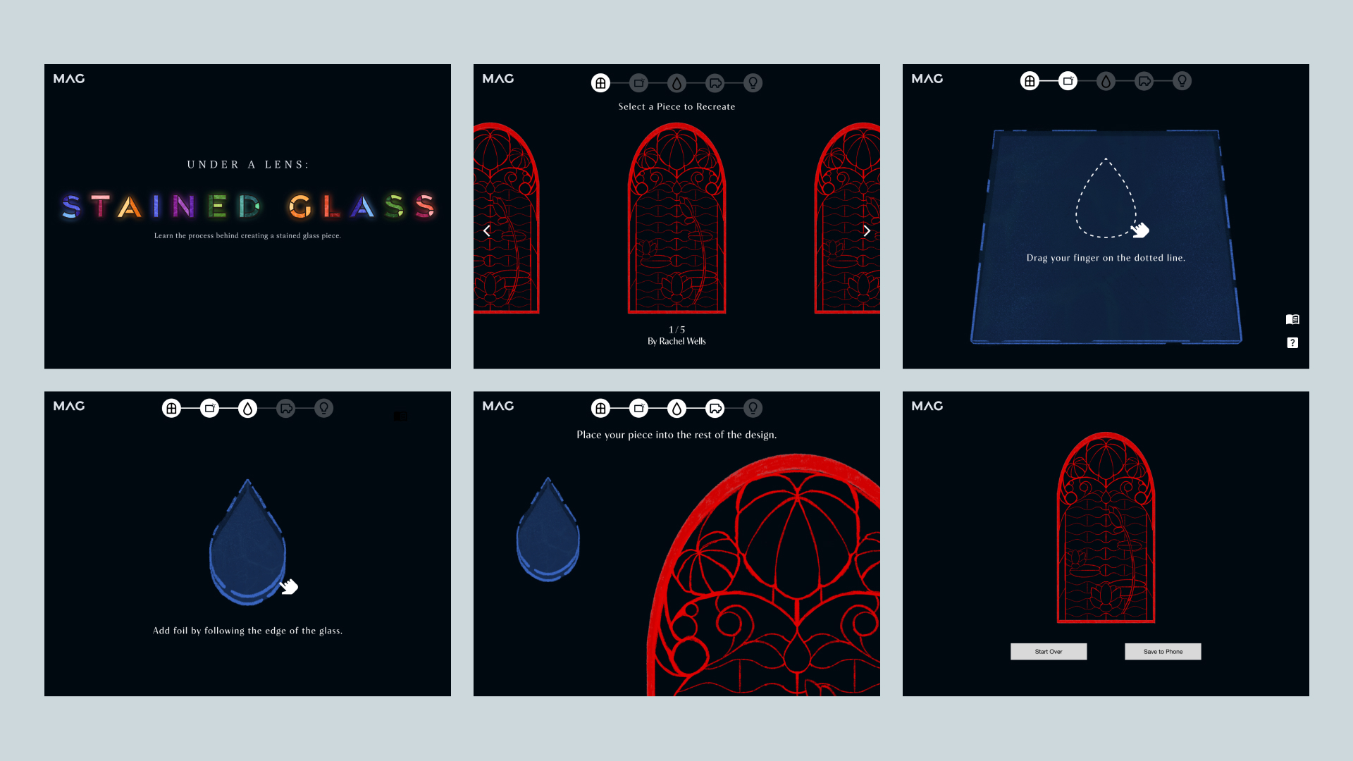
After researching and choosing a visual direction, I started to experiment more with aligning visual style with the structure established in the wireframes.
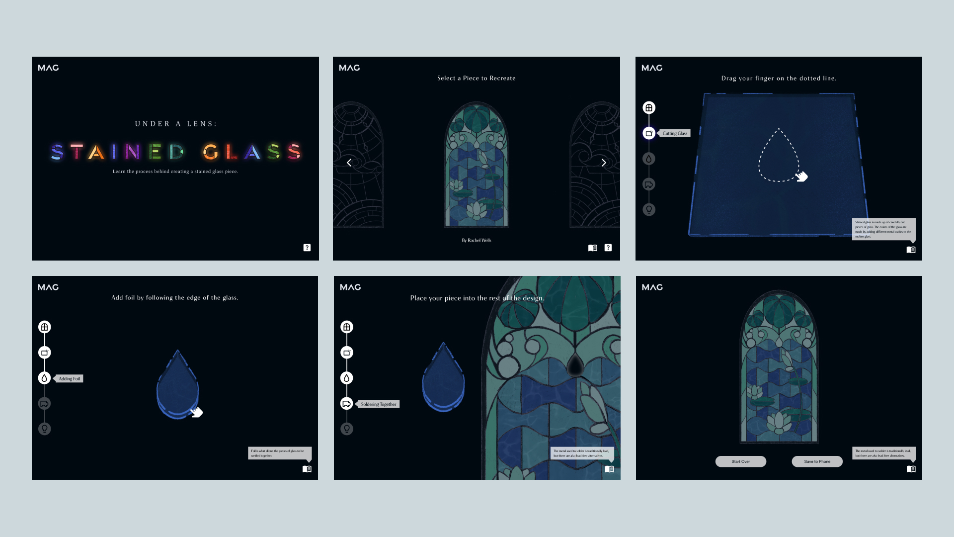
After performing user tests with prototypes, I found that the navigation's location was not ideal, and adjusted it to be on the left to interfere with the main focus less.
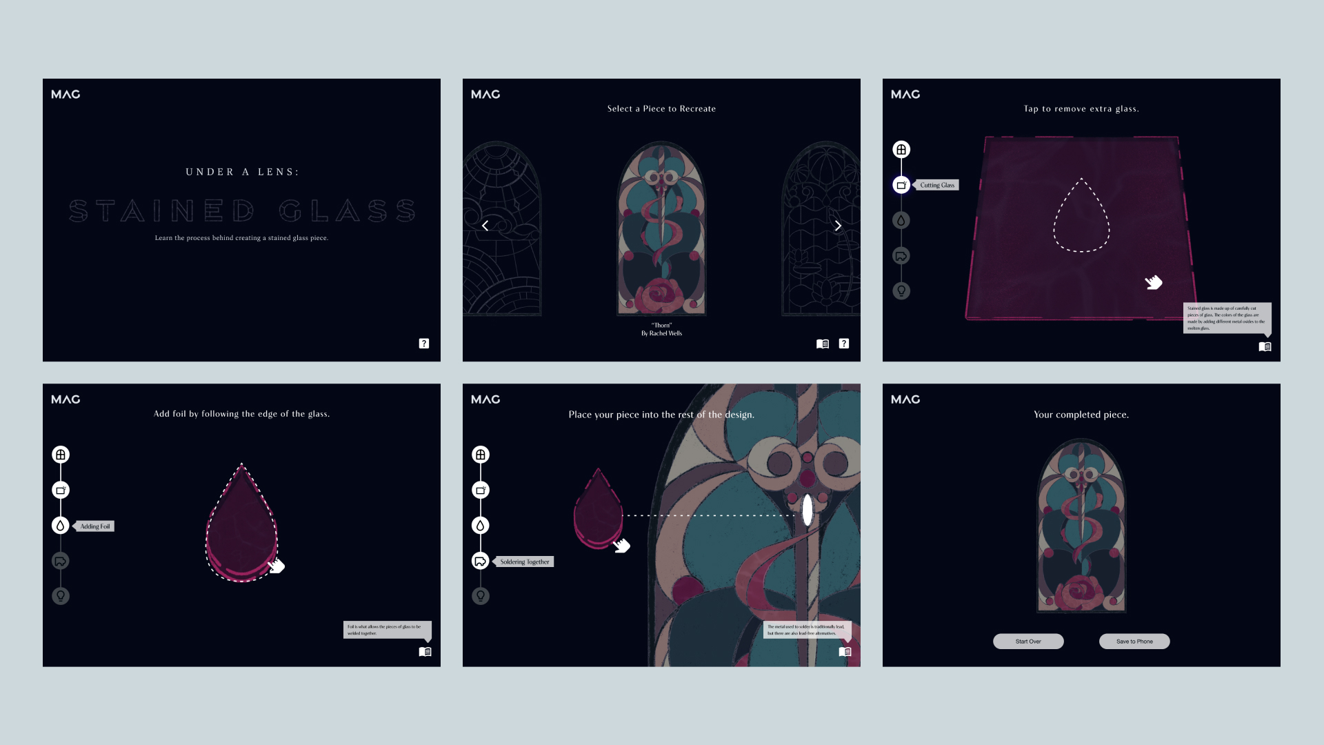
I also experimented with different illustrations in place of each other to ensure that the navigation works no matter which stained glass window is the focus.
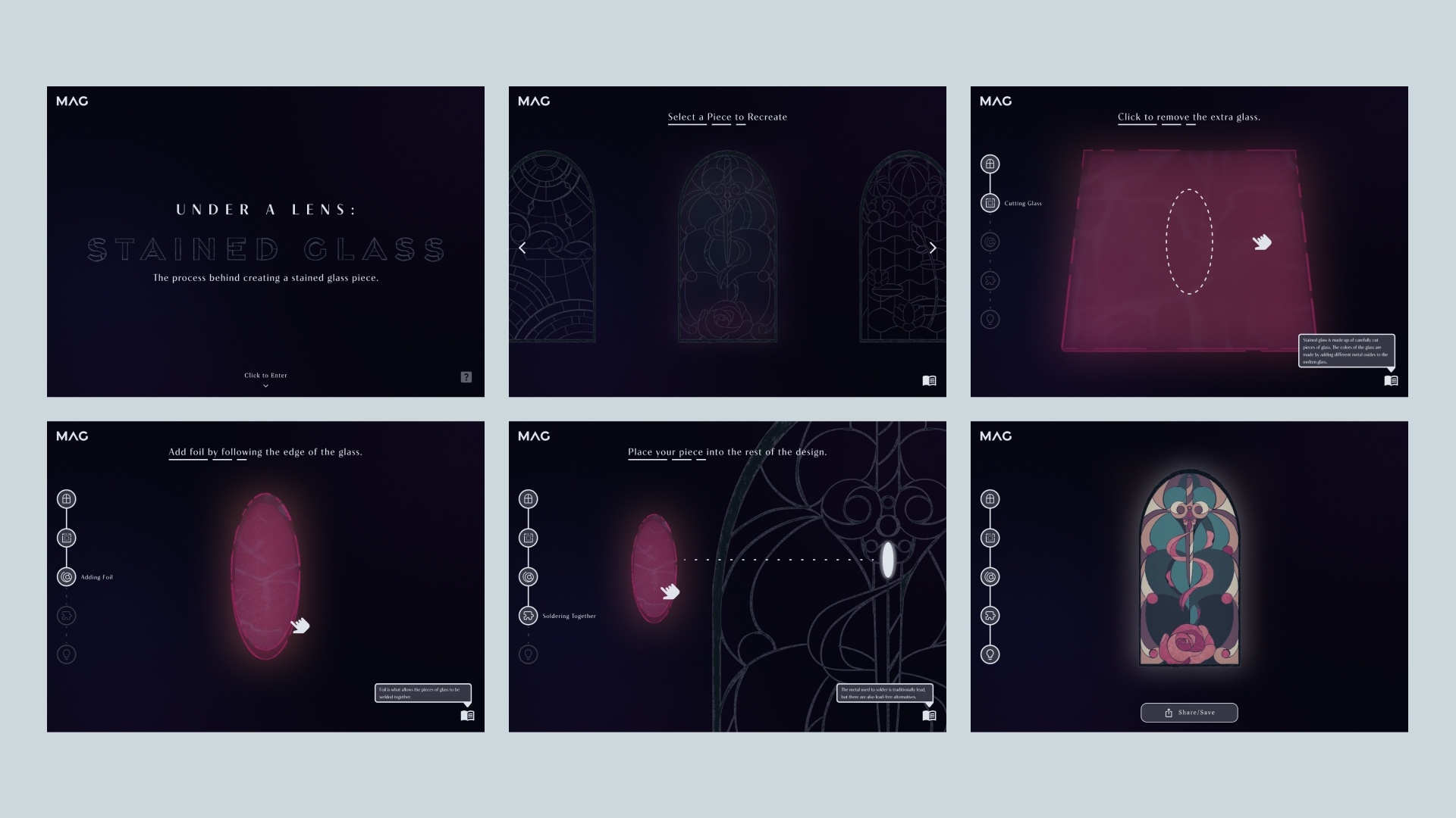
Creating atmosphere was my main goal in this version. I really wanted to achieve an illuminated feeling that really showcases the way light interacts with glass.
Illustrations
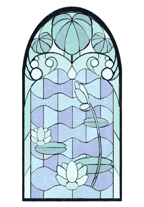
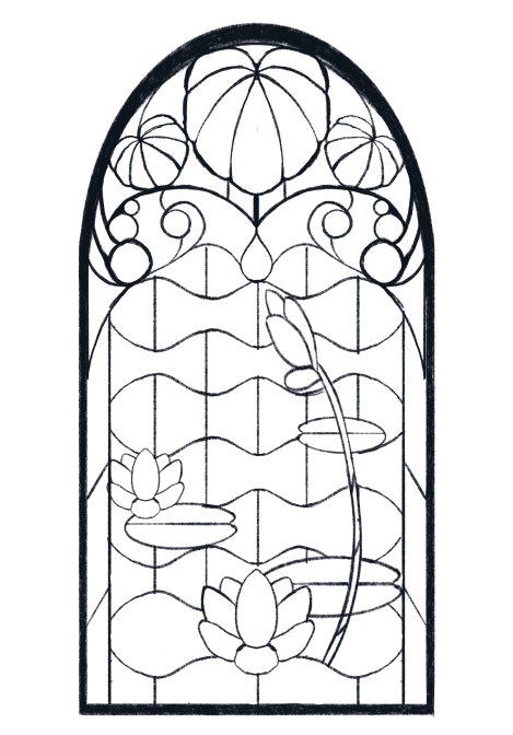
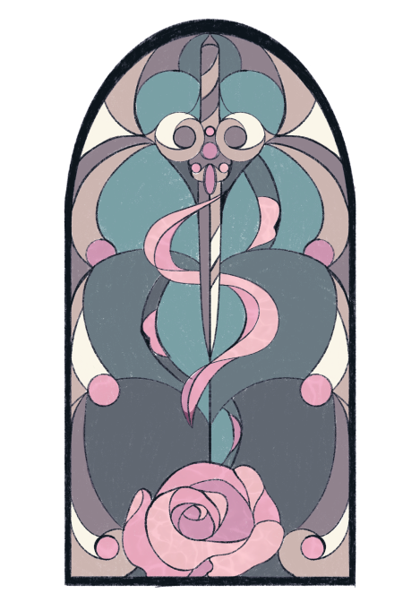
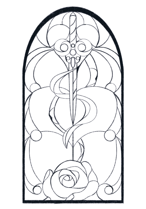
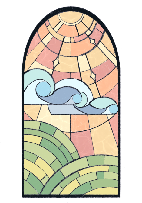
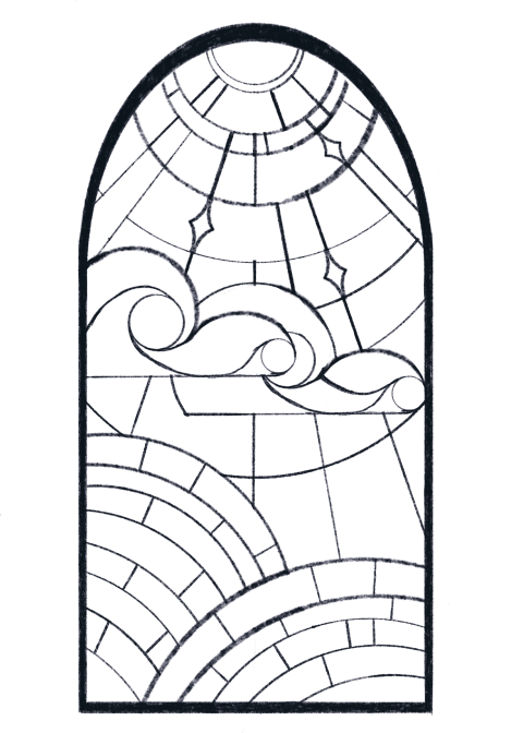
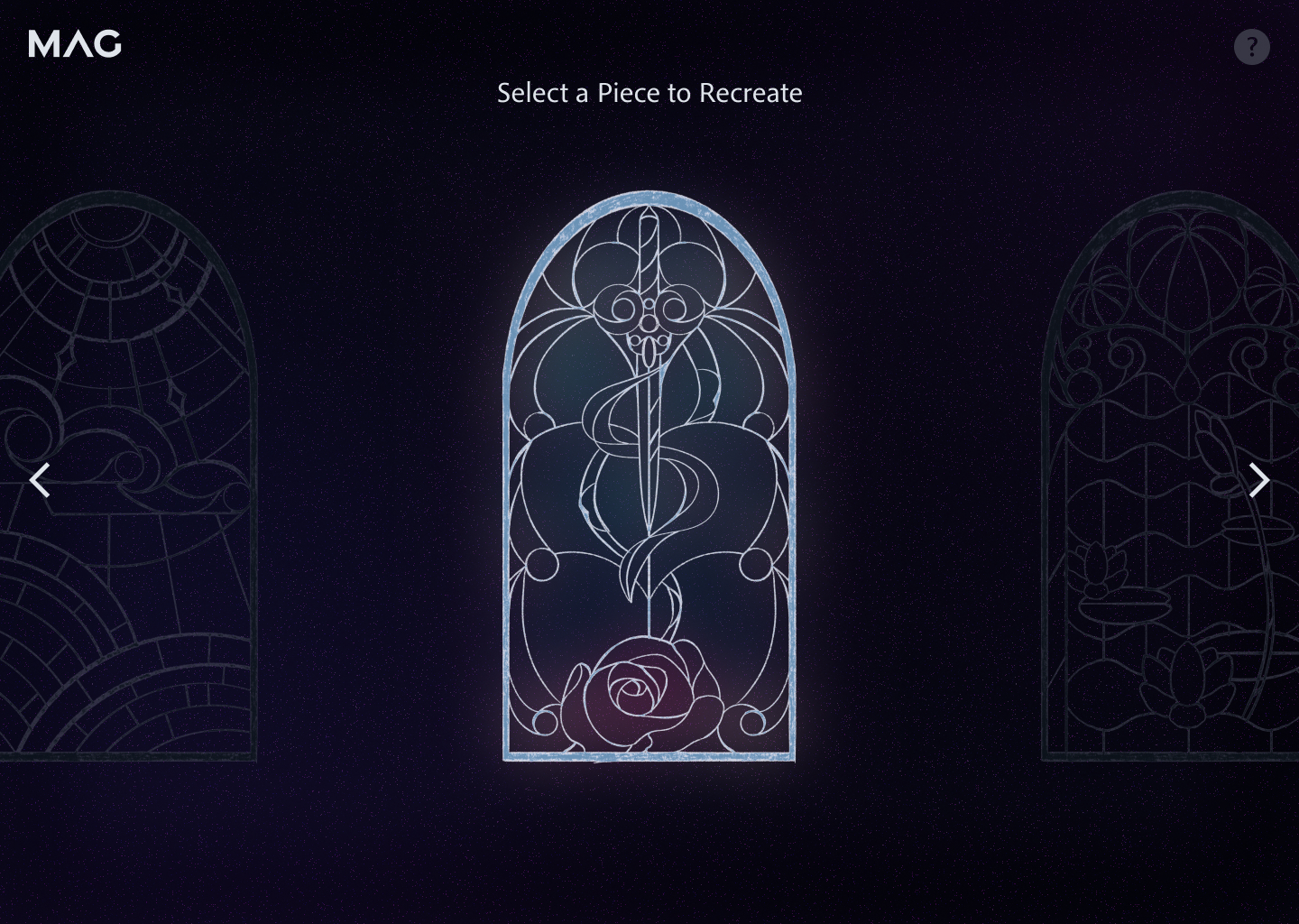
I wanted each to have a different motif while also being in the same shape frame. I designed them in a way that makes them balanced while still offering visual variety.
Final Solutions
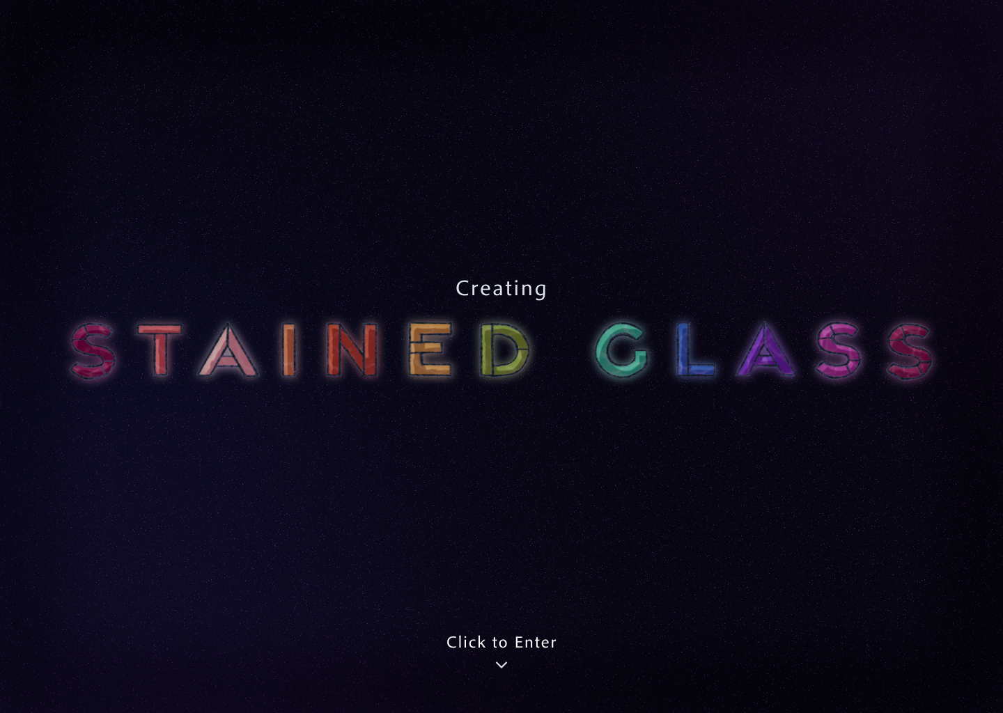
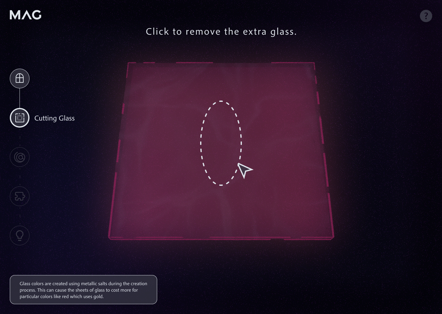
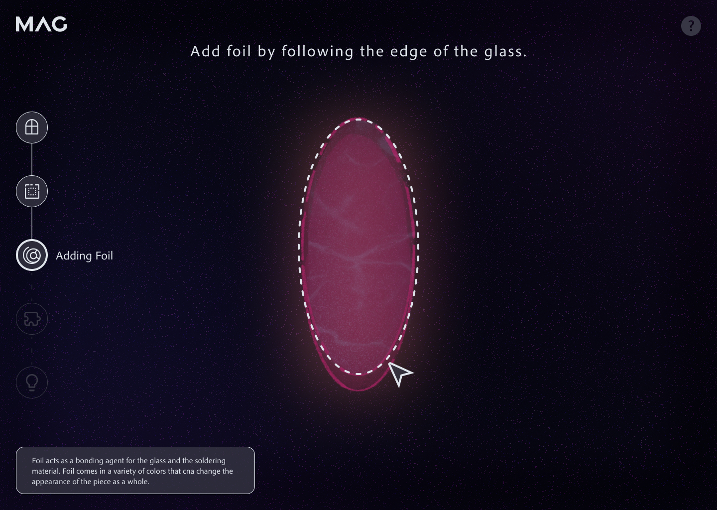
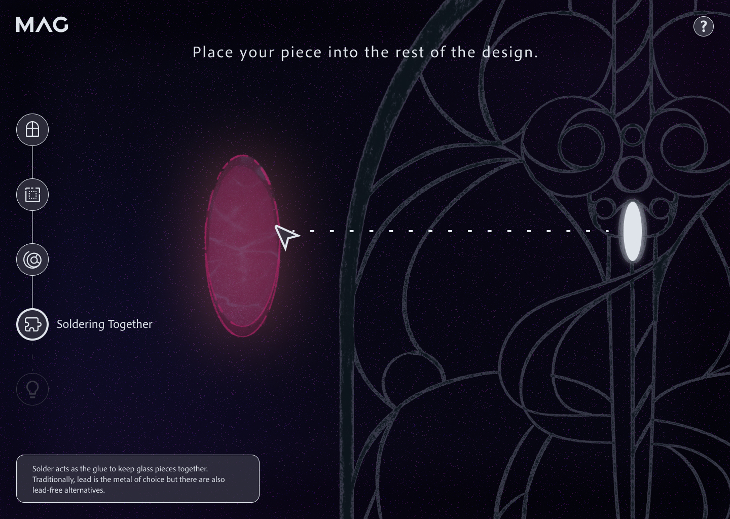
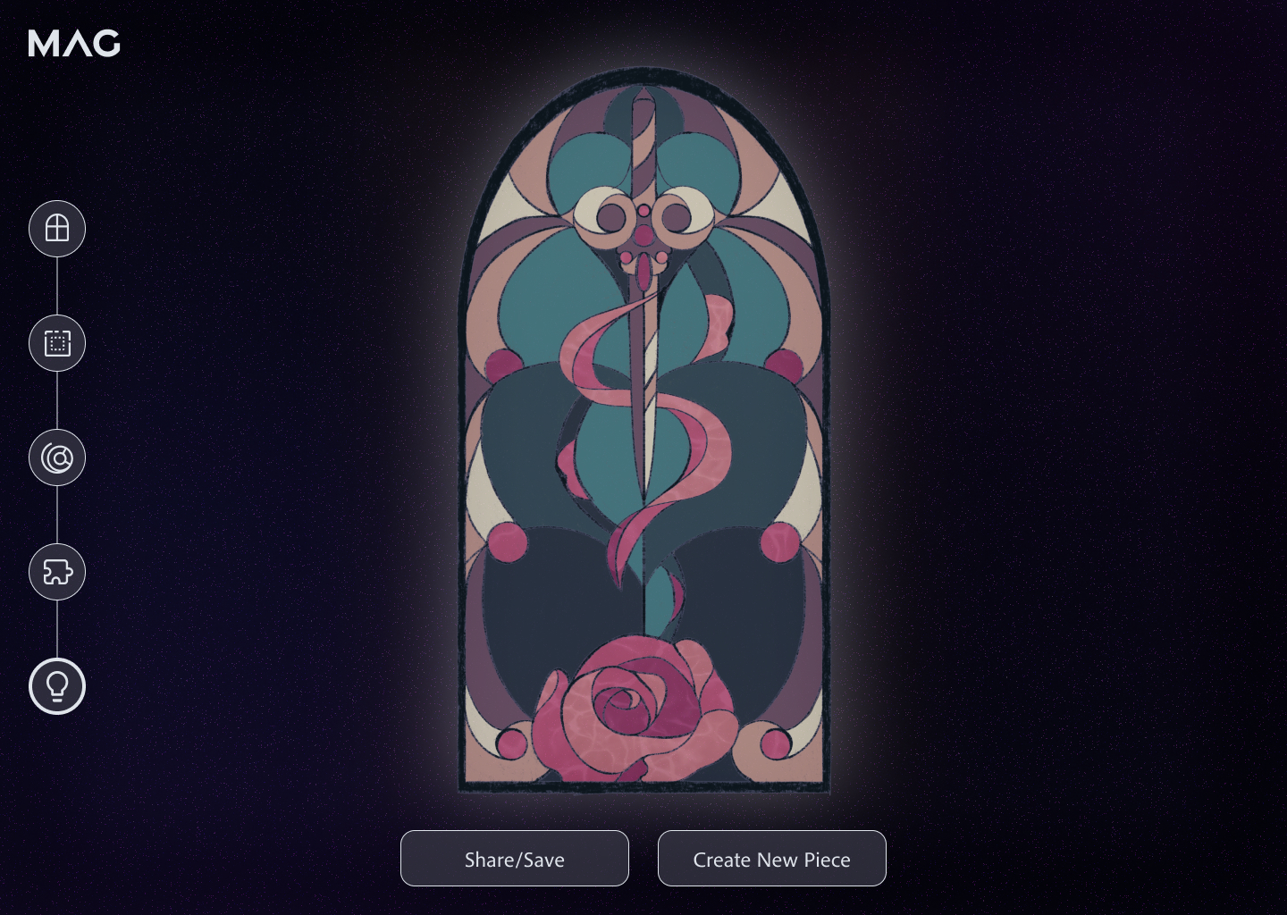
All illustrations were made in such a way as to have an ethereal look. Additionally, the navigation is a specified path on the left side that allows the user to see what step they are on without interfering with their experience.
Takeaways and Successes
Through discussing unsuccessful features with my peers and professor, I was able to land on a design that is successful in that it has museum exhibit-like looks while still being easy to navigate and follow instructions. Additionally, I was able to do small user tests to figure out which navigation style worked best, landing on a flow on the left side that creates an open area for the visitor to work.
Other Case Studies
Like what you see?
© Jenna DuBois 2026
Jenn(a) (DuB)oi(s)
Let's connect!
Reach me at
jenna@jennoi.design
