New York Digital ID
Duration • 5 weeks
Software • Figma, Adobe After Effects
Introduction
A driver's license is one of the most important forms of identification someone may carry daily. Still, with the global shift to having a completely digital wallet, licenses are falling behind.
This presented a challenge in modernizing the license to the mobile format and an opportunity to implement verification features a physical license could never have.
Design Process Overview

Competitive Analysis
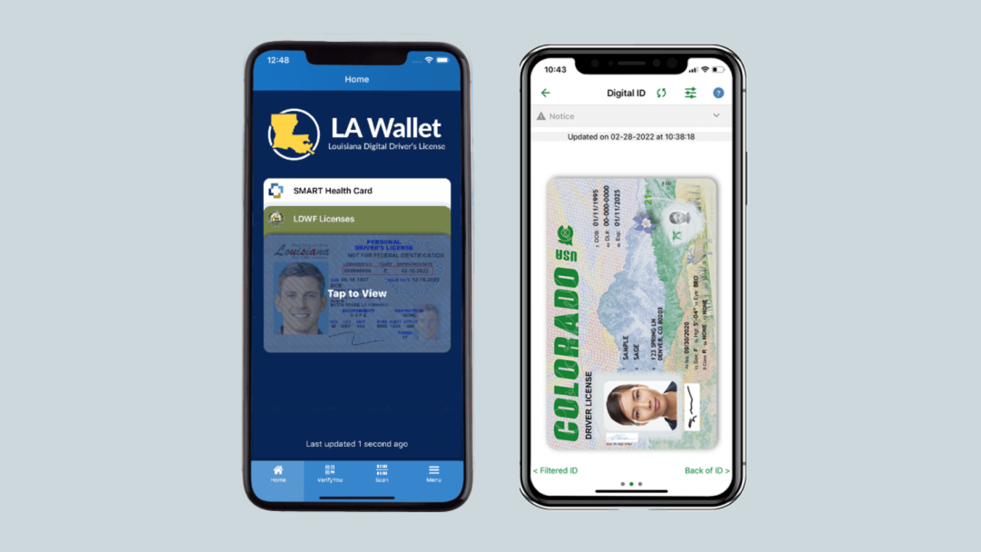
There is not currently a standardized way to bring your license into the mobile format, but there are some states that do have a beta form of a digital license.
Louisiana and Colorado both have such, however, they do not take the opportunity to reformat information and add more verification and security features. They are basically a scan of your already existing license.
Sketches
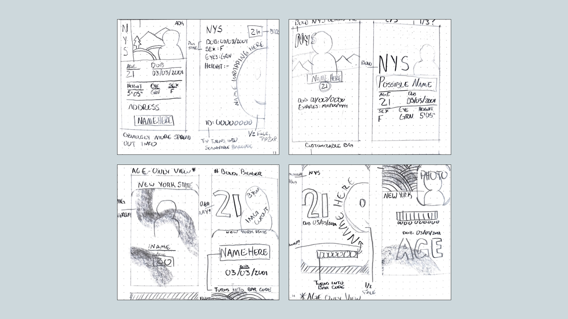
Sketches are a way for me to quickly feel out an idea without the worry of correctly aligning anything. I also use this as a chance to make notes for ideas to implement later. My goal was to restructure the information listed on a license to take advantage of the mobile format.
Wireframes
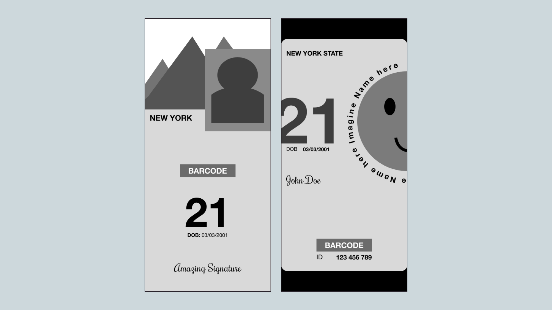
I chose two of my strongest sketch ideas and translated them digitally to see how they shape up with type and solid shapes. This allows me to quickly shape sketched ideas into more thoughtful screens.
Visual Perspectives
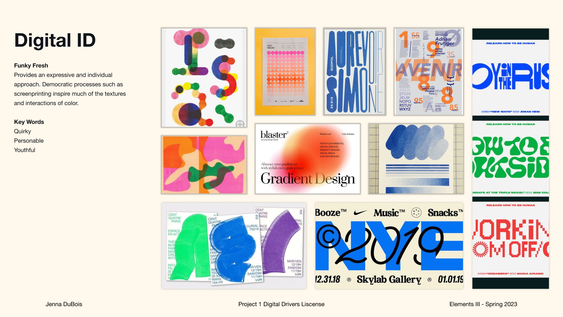
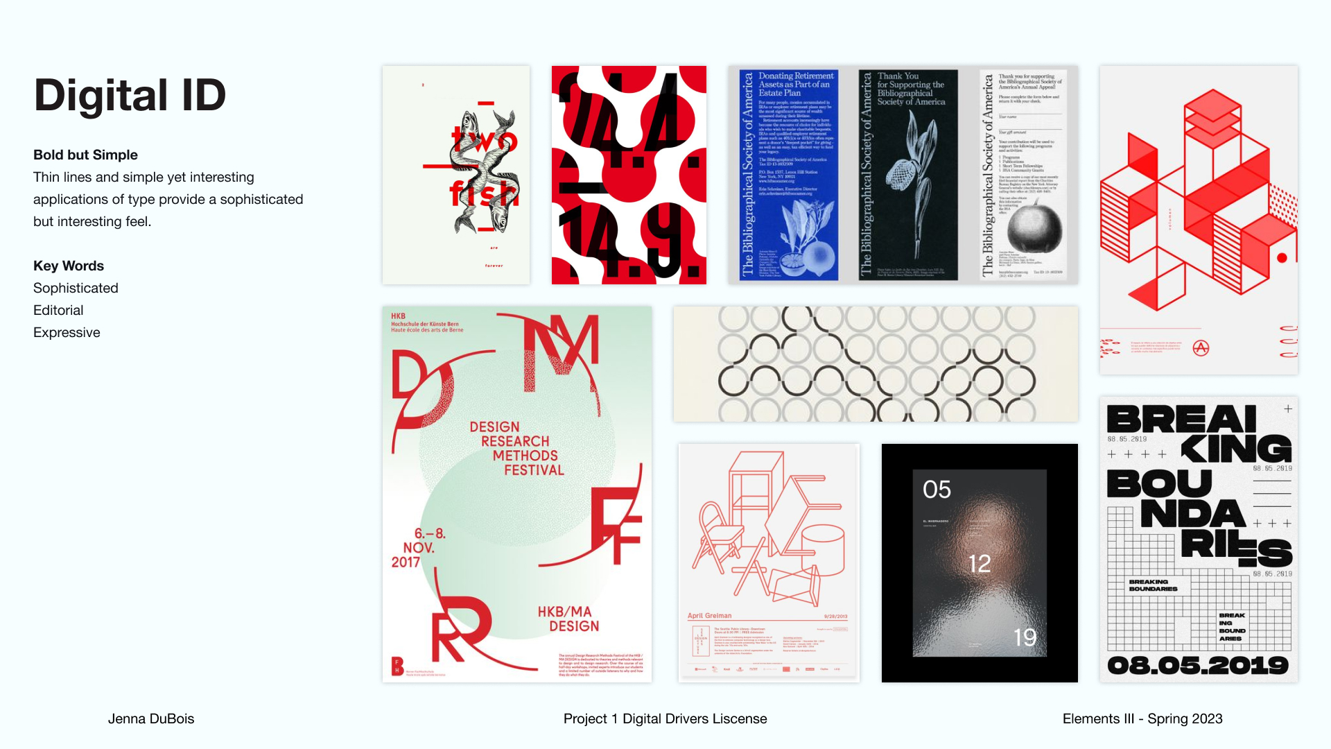
I created two potential style directions, one being more fun and youthful, and the other being more editorial and clean. To test each style, I began my design process making a screen based on each style's core aspects.
Iterations
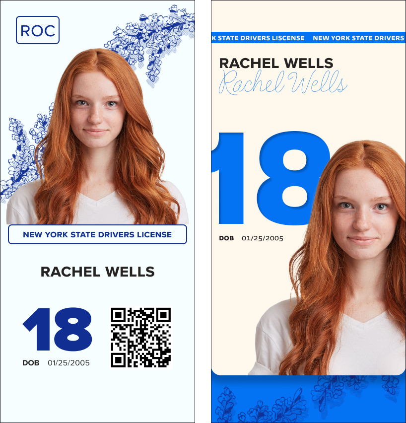
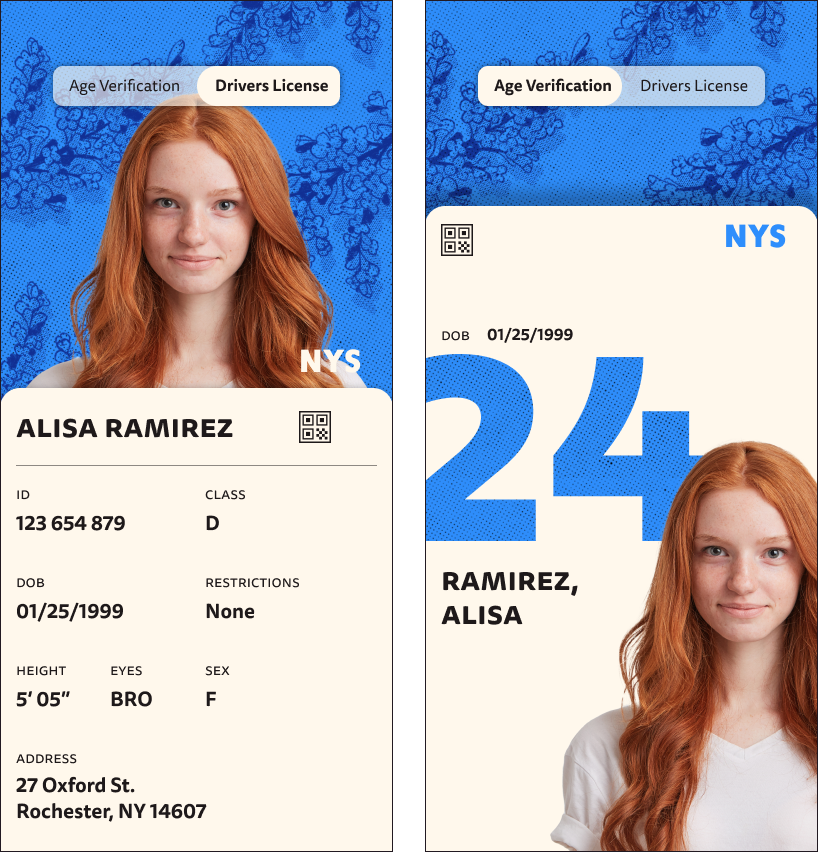
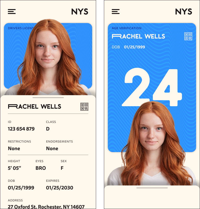
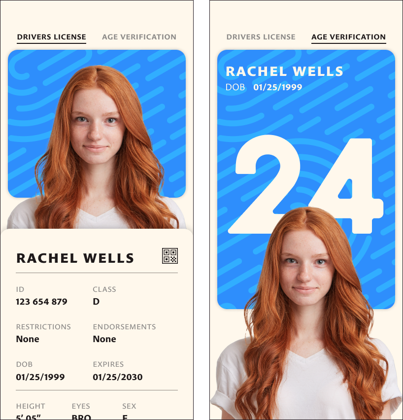
Working through iterations allowed me to take feedback and translate it into a coherent idea. With each iteration, I found that a version that allowed me to seamlessly switch between the screens for age-only and full license allowed for the best user experience.
For this seamless approach, I chose to use a drawer UX pattern as it's a familiar interaction but could still be used in a way that creates delight for the user. Additionally, I was able to nail down a concept that focused on a fingerprint motif to tie into your license being your identity.
Version 1
Version 2
Version 3
Version 4
Final Designs
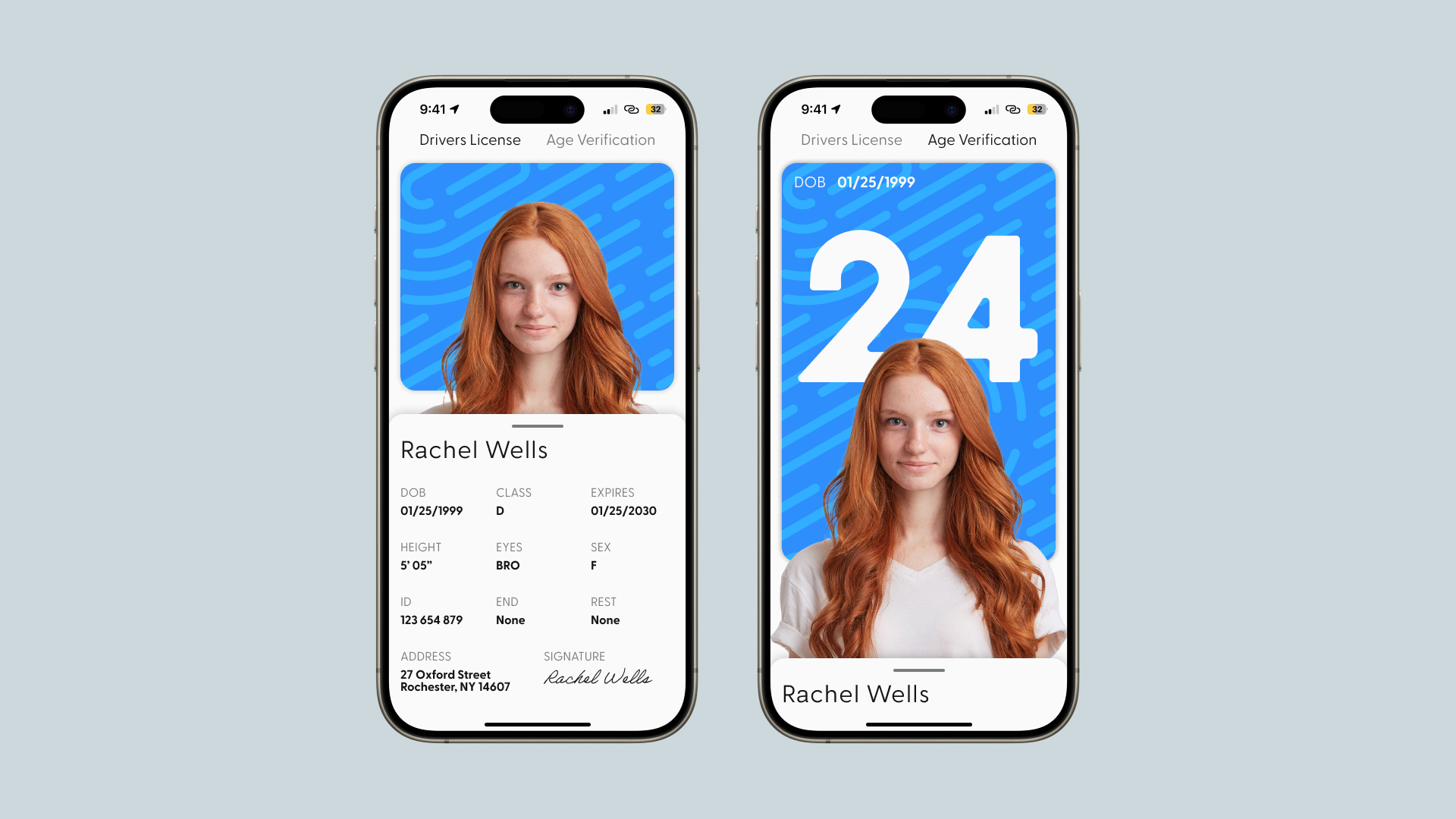
In my final designs, I focused on fine-tuning the layout, colors, and typography. I felt as though the screens would be clearer if I switched to a cooler-toned white and a typeface that felt more official. These changes allowed the more playful elements to really shine.
Prototype
Once the flat designs were finalized, I went to prototype for basic interactions and to show how verification can be seen. I chose to have the background behind the person's headshot animate in a way that is simple, but also effective and stays in the spirit of the fingerprint/identity motif.
Key Takeaways
My final result is successful as it not only restructures important information from licenses into the mobile format but also because of the verification features that could never be done with a physical license.
Digital licenses should take full advantage of the mobile format and innovate on security measures instead of being a literal carbon copy of your physical license.
Other Case Studies
Stained Glass Interactive
Starchitects
Like what you see?
