Abbott's Frozen Custard Kiosk
Duration • 15 weeks
Software • Figma, Adobe After Effects
Introduction
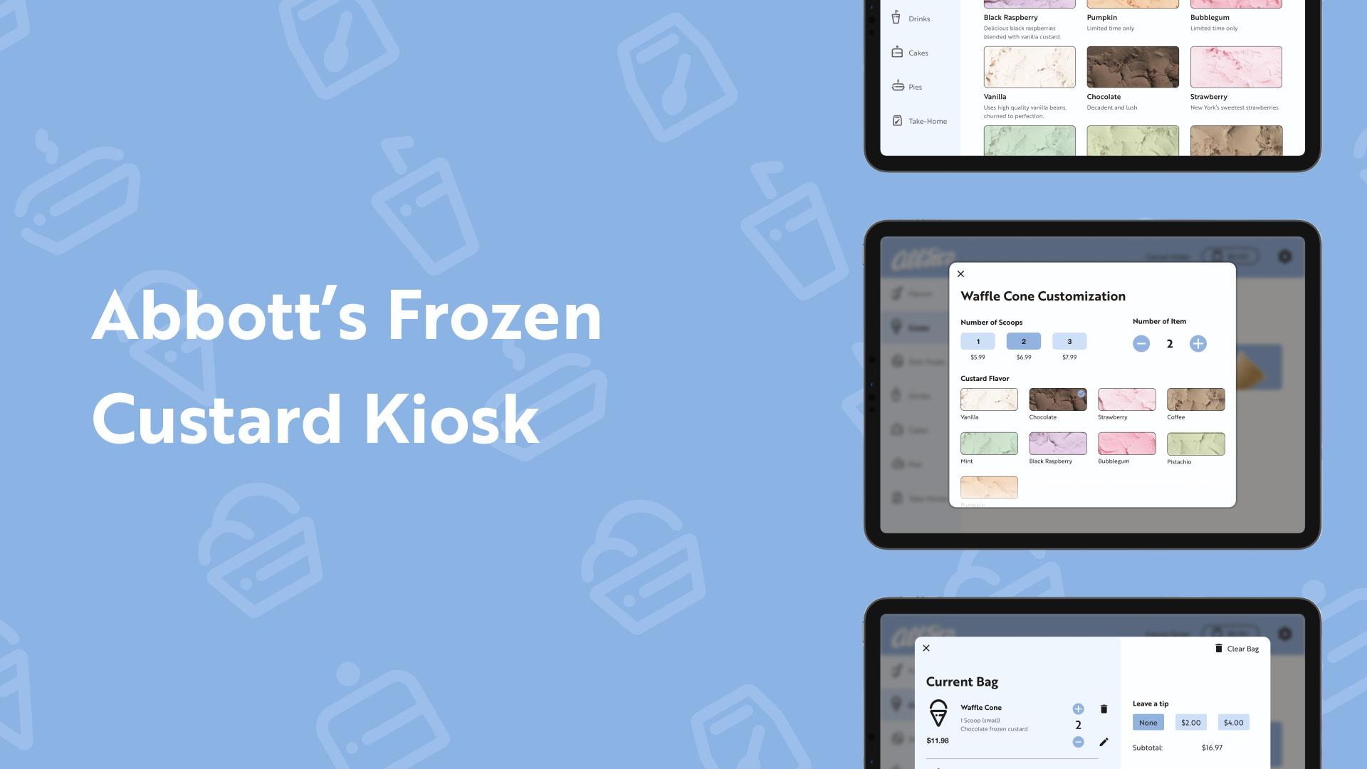
Abbott's Frozen Custard is a western New York frozen custard shop. They sell a variety of frozen treats in addition to their famous custard treats and are open every summer.
My goal was to create a thorough and well-documented kiosk that allows the user to quickly and easily navigate through an order.
Heuristic Evaluation
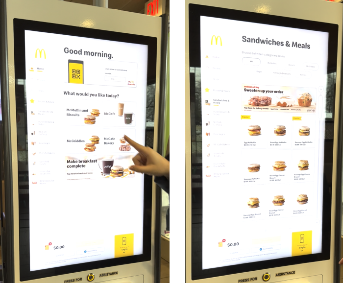
To better understand kiosk functionality and needs, I performed heuristic evaluations on kiosks already implemented in the real world. In my findings, I discovered things I would like to implement in my kiosk design and learned about usability issues that can arise when using a kiosk.
After that, I created a requirements document that established things to consider while designing the kiosk, such as screen size and model used.
Wireframing
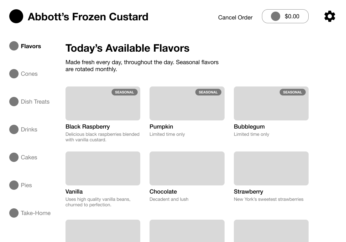
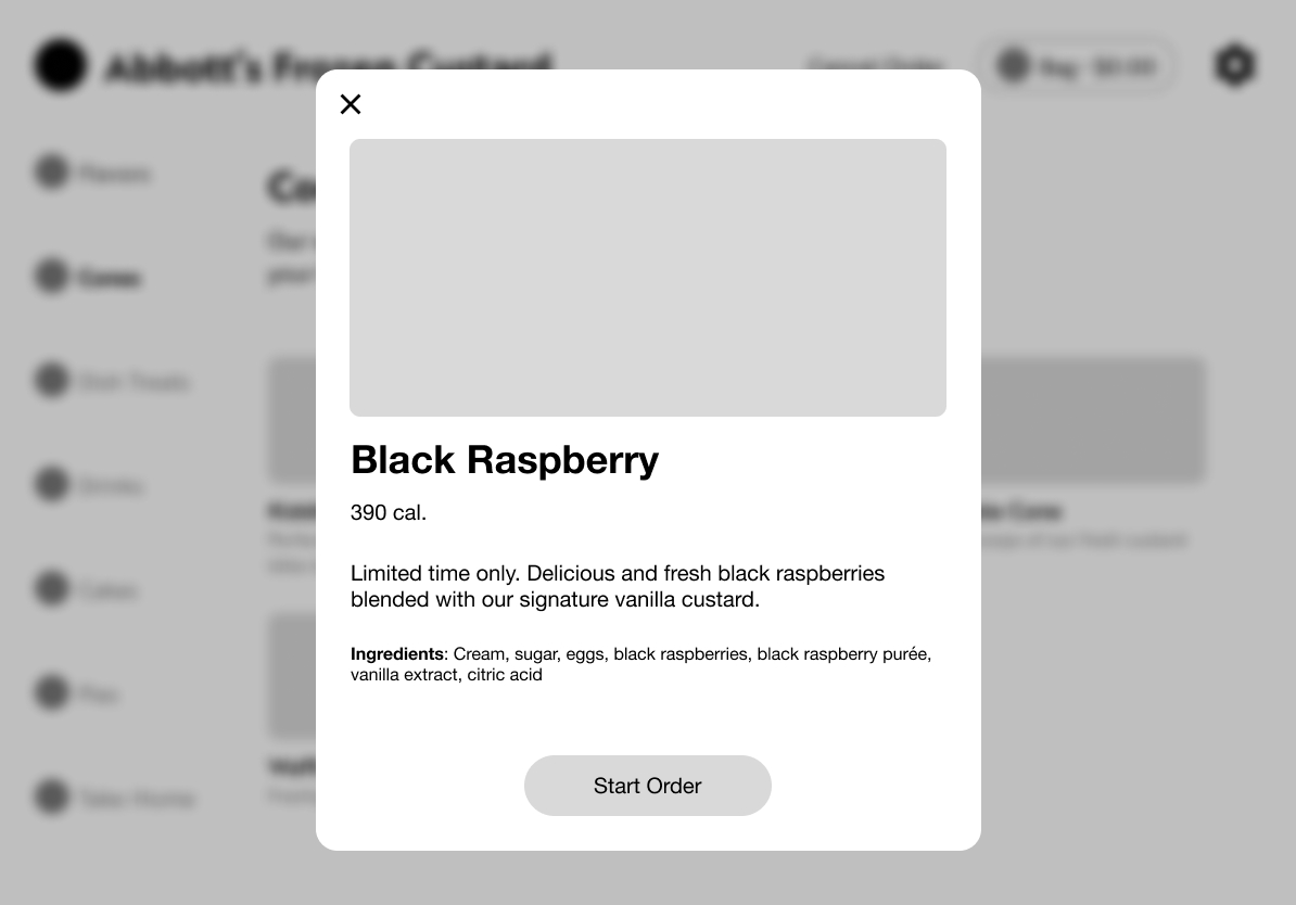
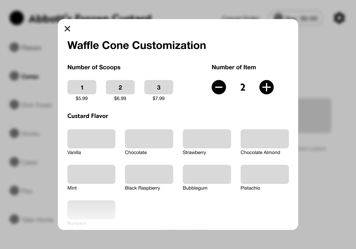
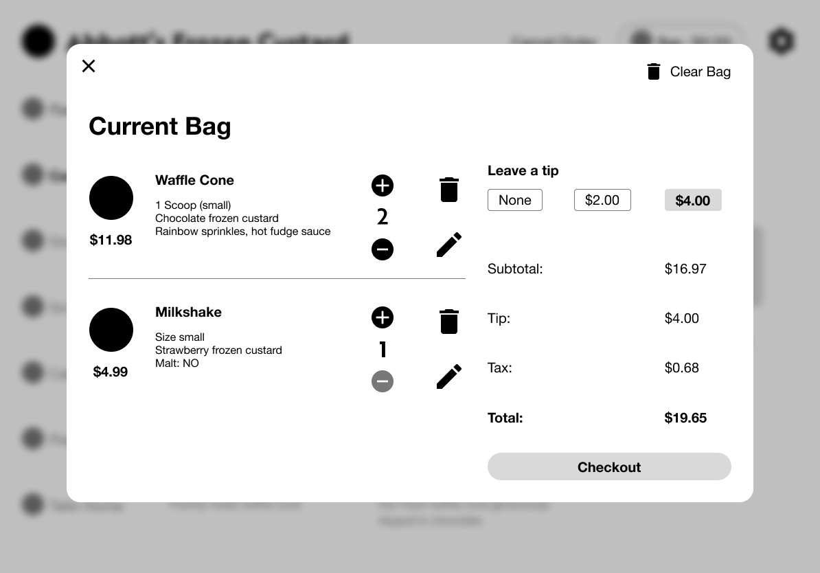
With my established requirements, I created wireframes that allowed the user to quickly select a product, customize it, and checkout. I also started to structure the kiosk in an imagery-first way for fast recognition.
Type and Color
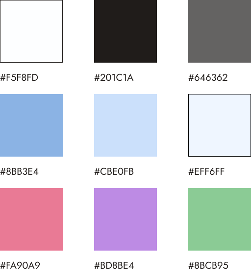
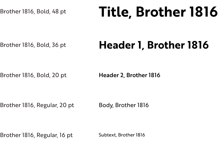
The colors used to expand upon Abbott's already existing signature light blue by adding lighter shades and more cemented base shades of white, grey, and black. Type-wise, the Brother 1816 typeface is clean and friendly to allow the user to seamlessly go through the interface.
Iteration
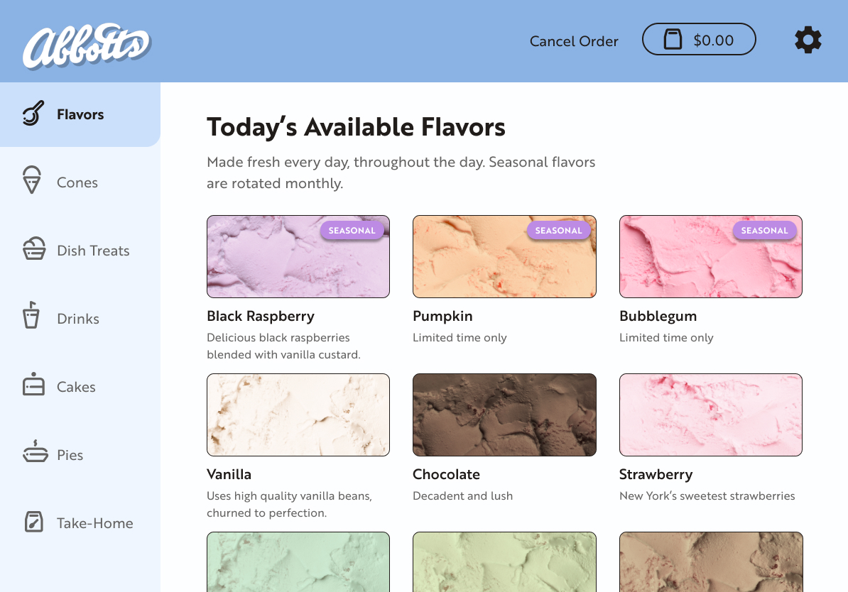
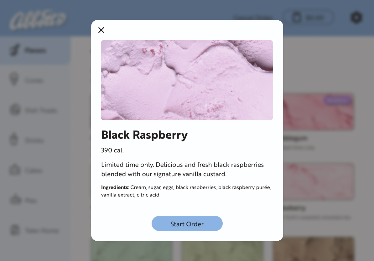
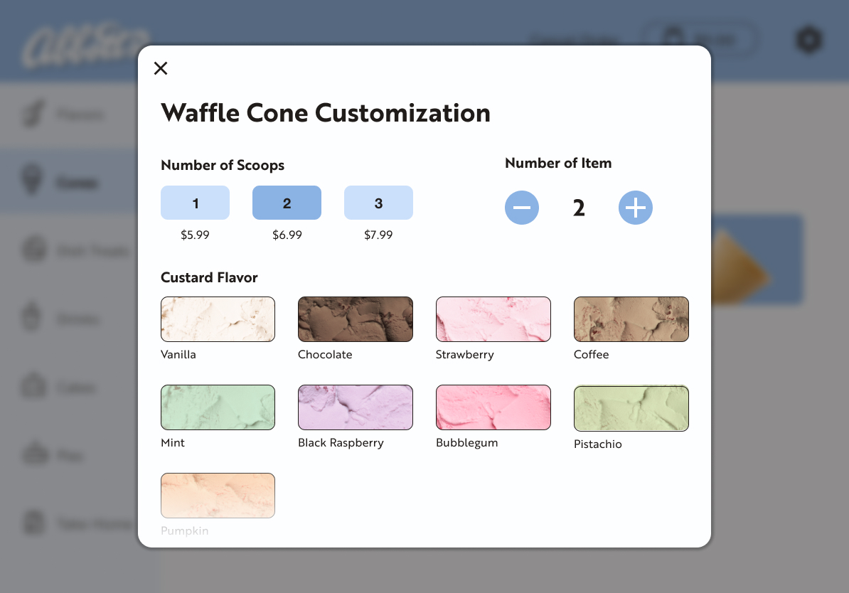
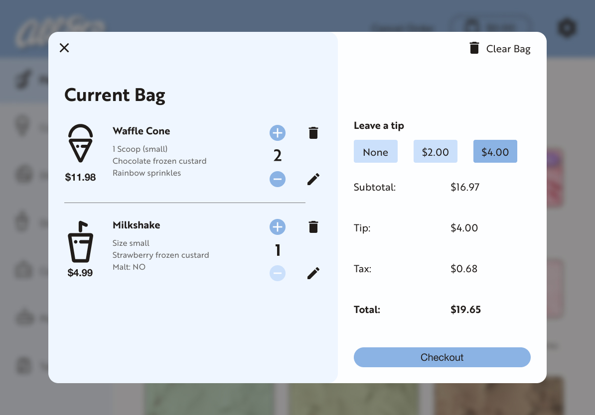
These screens take the general structure of the wireframes and apply the color, type, and photography styling. Using color to differentiate sections within the kiosk allows for it to also feel more on brand. Adjustments between wireframes and final designs were made as styles were applied.
Prototyping
The prototype shows a general path the user would take when placing an order, from selecting a product to checking out. Additionally, it allows me to better visualize planned interactions.
Takeaways
Organization is key when tackling something like creating a kiosk from scratch. I found creating style guides and mini design systems helped me streamline the process while also keeping the visual style consistent.
Additionally, iterating upon a design is extremely important, as wireframes may help with structure, but not as much with flow and aesthetics.
Other Case Studies
Like what you see?
© Jenna DuBois 2026
Jenn(a) (DuB)oi(s)
Let's connect!
Reach me at
jenna@jennoi.design
